fbpx
x
Blog
Search - RSTickets! Pro Knowledgebase
Search - Categories
Search - Contacts
Pages
Search - News Feeds
Search - Tags
CLOSE

Take a Stress-Free Vacation This Summer (and Keep Your Business Running)

By

An OnDeck Vacation Study reported that only 57% of small business owners planned on taking a vacation last year. Further, only about a quarter of these owners would allow themselves a few days away from work.

There were a couple more disturbing facts that came out of this infographic. The first being that the majority of small business owners wouldn’t fully disconnect from work while on vacation; another discouraging statistic showed a greater reluctance among self-employed individuals—especially those with new businesses—to take a vacation at all.

Considering how costly burnout can be for freelancers and small business owners, it’s a much wiser choice to put aside any fears you have and make time for a vacation this year.

Rather than give you the usual advice (ie: plan ahead, notify your clients, disconnect from technology, and relax), I prefer to go the more practical route. Below, you will find 12 things you can do to have a stress-free vacation while keeping your business running.

Read more
  3222 Hits
  0 Comments
3222 Hits
0 Comments

11 Secrets of Actionable UX Reports

By

When designers and developers work on projects, they have a lot of questions: What do our users expect to see on this screen? How are users supposed to interact with our product? What should our onboarding feel like? These questions are commonly asked during product development.

Every team wants to reduce the risk of incorrect design decisions and as the complexity of products increases, the digital product design industry puts usability practitioners in high demand. Usability practitioners are people who help product teams make informed decisions. In most organizations, the primary role of usability experts is design validation—making sure that a product is usable.

But many usability practitioners (particularly those who are new to the field) complain that product teams don’t act on their research results. While this could be due to many different issues, most often it is due to poor usability reports; if product teams have trouble understanding findings, or don’t know what to do with the findings, they’ll simply ignore them.

That’s why it so important to make reports actionable. In this article, we’ll share eleven tips that help usability practitioners to reach this goal.


1. Know Key Business Objectives

Most companies have a clear understanding of what their business goals are. The reason companies invest money in usability analysis is that they believe that it will help them reach their goals.

It’s possible to put more weight into usability reports by creating a direct connection between solving usability issues and reaching business goals. Thus, usability experts should take enough time to figure out what the key business objectives are and make sure that the usability insights are aligned with them.


2. Be Specific When Presenting Findings

Imagine when someone opens a usability report and sees a sentence like: “The process of purchasing a product was hard,” without any additional details. With a high probability, they will consider such a finding as too vague. Vague findings don’t give product teams many insights. A lack of detail can, at best, leave teams wondering what the problem was. But at worse it can lead to an unfavorable outcome—when a product team misinterprets findings they can start solving a wrong problem.

That’s why all findings in a report need to be specific. It’s essential to write usability findings in a clear way that helps the team identify the cause of a problem and work toward a solution. Thus, instead of saying “The process of purchasing a product was hard,” provide a clear context for the issue. Say why the process was hard. Were too many steps involved? Were field labels in forms unclear? Make it clear in your report!


3. Never Blame Users

Describing findings in relation to users is a relatively common problem of many studies. “The user had to do this” or “Unfortunately, a user was unable to …” Although such statements sound innocent, they can cause significant damage to your reports. Such language switches the focus from a design and puts the blame on the user. It becomes a user problem, not a product problem. When team members and stakeholders read such findings, they might think “Well, this user wasn’t experienced. Maybe we should conduct another testing session with more experienced testers?” and can dismiss the issue.

One of the purposes of a research study is to generate empathy for the end user. Good UX practitioners always start usability testing session with words “We’re not testing you, we’re testing our product.” The same attitude should be used in usability reports.


4. Don’t Lose Sight of the Wood for the Trees

A famous Charles Eames quote: “The details are not the details. They make the design” is a bad joke for some usability professionals.

All too often they become too focused on the details, so they forget to notice huge issues. For example, when analyzing specific user flow, it’s easy to be focused on providing concrete recommendations on how to improve user experience (e.g. changing the size of the buttons, renaming labels, etc.), but forgetting to notice that the entire flow doesn’t match user expectations or doesn’t meet their needs. If users have trouble at every step, perhaps it’s the overall flow that’s to blame, rather than separate details along the way.


5. Add Redesign Recommendations to Usability Reports

The goal of user research and usability testing is not only in finding issues and defects; it’s also proposing solutions to those problems. Too frequently usability practitioners conduct usability testing, track all issues, but don’t provide recommendations on how to fix the problems. Recommendations play an essential role—they help determine next steps and make the results actionable.

Usability practitioners are the right people for writing recommendations because they have unique expertise in thinking about design solutions. They run lots of usability tests and have first-hand knowledge of what works and what doesn’t work for users.

Writing useful and usable recommendations is a skill that all usability professionals should master. Here are a few things that should be taken into account when writing recommendations:

Avoid vague proposals: Vague recommendations such as “Make the error message clearer” doesn’t say enough for people who’ll read reports. It’s essential to make recommendations constructive by providing sufficient details. Avoid biased recommendations: Stay away from assumptions. Reference studies and best practices in your report. Discuss your usability recommendations: Talk with designers, developers, sales and marketing teams to learn what works and what doesn’t work both from a business and technical point of view. The wisdom of the crowd can help you to come up with better solutions. Write recommendations in the readers’ language: The readers of recommendations are not necessary usability specialists. Thus, avoid usability jargon such as “508 compliant” when providing recommendations. Visualize your recommendations. A picture is worth a thousand words and this rule applies to recommendations. Visualizing recommendations doesn’t mean that usability specialists should create high-fidelity interactive prototypes. Creating a quick sketch to illustrate a point is totally acceptable.


6. Involve Teams and Stakeholders in Usability Testing

Work closely with the design and development team, rather than simply delivering a report and walking away from the project. Make team members and stakeholders contribute towards study designs.

Here are a couple of tips to take into account:

Ask designers, product managers, marketers about their expectations before conducting testing. By asking a simple question “After we conduct this research, what results would you expect?” you build interest to the upcoming test session. Invite team members and stakeholders to watch usability testing sessions. Nothing beats watching how users interact with a product. Seeing how users struggle when working with a product will make stakeholders understand the value of session.


7. Keep Your Reports Short and Focused

Readers of usability reports are busy people, and it’s relatively easy to overwhelming them by putting too much information in a report. Long lists of recommendations are less likely to be read and acted upon. Remember that with each additional issue mentioned in a report, you decrease a chance that readers will reach the final page of your report. Thus, keep the report short and focused.


8. Rank Findings

No one team has infinite time to solve all possible issues which were found during usability testing. It’s vital to understand that every issue that was discovered through usability testing is not equally important. Usability practitioners should prioritize all findings and put a focus on the most important ones. Ranking findings as low, medium or high severity helps the team understand what critical issues the usability study exposed

But before assigning a priority, it’s essential to work with a product team and stakeholders to build a consensus around what is considered as a high priority usability issue vs. what is recognized as a low priority.


9. Make Your Reports Sound Human

Don’t just list your findings and recommendations; describe them in a format of a story—a story of interaction users with a product. Usability reports are the most impactful when they illustrate problems using video clips of test participants and when they contain participant quotes recorded during testing sessions.


10. Customize Your Report for Different Audiences

It’s worth creating a few versions of usability reports for different audiences. For example, when it comes to writing a report for developers, you can provide more technical details, but for stakeholders, you may only skim an executive summary of prioritized issues.


11. Actively Promote Your Findings

It’s not enough to conduct testing, send a report as an email attachment and believe that team members will read it and act upon it. Usability practitioners should actively market their findings—make sure every person who needs to know, is familiar with your report.

Read more
  9402 Hits
  0 Comments
9402 Hits
0 Comments

GoDaddy Changes its Logo (Again), Loses its Daddy

By

Once upon a time in the long lost world of the 1997 (more or less), a little boy was growing up watching Hercules: the Legendary Journeys, and Xena: Warrior Princess on the weekends. He got a Hotmail account because all of his siblings had one; but he didn’t really know anyone else who had email. Still, the spark was struck, and his interest in the Internet was born.

Around the same time, GoDaddy was born; born into a world of wondrous possibility, creativity, and hope for a technocratic utopia that we were all sure would be made possible by the Internet. Well, that didn’t work out so well, but GoDaddy, at least, would go on to become the largest ICANN-approved domain registrar by 2005, and was the first place that little boy ever bought a domain name.

In that time, it was common for Internet companies to embrace the wild west of the Internet with branding that reflected the “wacky”, “zany”, and generally Nickelodeon-ish aesthetic preferred by those who were engineers first, and designers second…or fifth–look, it took a while to get the print guys on board. Anyway, anyone who was anyone used either a sort of “hand-made” look in all of their branding, or super-corporate branding a la IBM.

That age is long gone, with both the informal-looking branding and our dreams of technocracy drifting into the past. GoDaddy had already updated the text in their logo to look a little more modern back in 2016, but now, the mascot informally known as “Daddy” is going away, too. It’s the end of an era.

(For comparison, we turn now to these images sourced from Logopedia, which is a real thing I just found out about. I plan to waste a fair amount of time there.)

Read more

Blog fields

  • 5 minutes
  58 Hits
  0 Comments
58 Hits
0 Comments

How To Design The Perfect Gradient

By

When you work for a user experience design company for as long as I have, you start to notice the cyclical nature of industry trends. Just like fashion or art, what goes out of style inevitably resurfaces a few years down the road, only to become adopted by the mainstream, and fade into obsoletion once again.

In the digital design world, there’s maybe no better example of this than the rise and fall (and rise) of the gradient. Considered a lynchpin of interface design in the nineties (how many geocities sites had a gradient WordArt header?), the trend likely dates back even farther. Consider this iconic logo:

‘Back To The Future’ is a fitting example for a design trend that has just recently resurfaced today, perhaps most notably in Instagram’s logo redesign in 2016 and Spotify’s dual tone playlist icon. Gradients have become increasingly popular in the user interface design world, and for good reason—they inject depth and texture to the interface. They serve unique, even conflicting roles: gradients realistically mimic the colors we see around us (rarely do we encounter single tones in the real world), but they can also be used to create color patterns we’ve never seen before.

When used improperly, gradients spell out a design disaster

The gradient is a powerful design technique, and with great power comes great responsibility. When used improperly, gradients spell out a design disaster. They can muddle a layout, distract the user, and ruin an interface’s entire aesthetic. In this article (with the help of my trusty team of UX designers), we reveal the secret to crafting a gradient that elevates your interface to the next echelon, rather than remind the user of 1997.

Read more
  3158 Hits
  0 Comments
3158 Hits
0 Comments

The Secret Designer: The Time I Almost Worked for Satan

By

No matter how much we might wish otherwise, money is integral to our society and our lives. It’s a powerful motivator, and it can tempt even the most morally upright and ethically-concerned among us. And let’s be very clear: I try to be a decent person, but I would not call myself the “most” anything. For all that I once dreamed of being a superhero as a child, I can’t claim superiority now.

And so when Satan (I’ll explain…) came and asked me to name my price, I very nearly worked for him, or some of his representatives, anyway.

Imagine, if you will, a political party that most rational people would call “evil”, or at the very least: “misguided in the extreme”. While many people the world over are reasonably concerned about things like immigration, these people would be the first to sling racist nicknames around. Not for free speech, oh no. Because they liked it. They genuinely believed themselves to be on a crusade against impurity, against invaders.

They weren’t violent, as such. No white hoods. They just wanted everyone else to “stay home”, and weren’t afraid to use dirty political tricks to achieve this. They were ignorant. They believed every crackpot theory that even smelled like a conspiracy.

A party name just popped into your head, didn’t it? There are parties like the one I’ve described all over the world. Sure, it’s that one. Let’s go with that one. For brevity’s sake, I’ll call them the PoS, which mostly stands for The Party of Satan. Last note before the story continues: they are not in my country.


The Approach

They approached me online, and asked if I would be interested in doing some design work for them. I was, as you can imagine, quite hesitant. Well, no one starts out with the intention to sell their soul. But I was curious. How could I not be? For one, I wanted to see if they were as bad as everyone said.

They asked me to look at a website they’d set up for their very own PoS news network: just a simple WordPress setup with a minimal theme. They wanted to know if I’d “spruce it up” a little, and generally just make it look more appealing. And I actually said “no” to that. I couldn’t bring myself to directly work on anything they touched. That would put me too close to the racism, in my own eyes.

But this was a political party, so they had money. I was a relatively new and poor designer, so I wanted some of that money. I decided that I could probably live with it if I worked only as a consultant. I could look at their site, and tell them how to make it look a bit better, and make it more usable. It wasn’t anything they couldn’t learn themselves with some Googling, anyway. After spending quite a bit of time rationalizing (I’ll explain…), I thought, “I’ll ask them for [a lot of money]. If they say yes, then what the hell?”


Temptation & Rationalization is the Worst Jane Austen Book

Well, they didn’t even blink.

My rationalization was that I lived in a different country, surrounded by people they didn’t like very much in any case. I would take that money (which, at the time, I could have lived on for a year), and spend it in the local economy. The money would only benefit their “enemies”. And it was not as if they would simply shut down and fall apart without my help. Some “good” might as well come of it.

I wish I could tell you that everything fell through when I came to my senses, and realized that no amount of money was worth my integrity or self respect. The truth is that my sense of integrity was still forming at the time, and I had no self respect to speak of. The truth is that I could only think of myself, and how I could live off that money while working on grandiose ideas like “writing a book”.

I was in my very early twenties. That would have been a terrible book, anyway.


And Then it Fell Apart

It was mere chance and a lack of forethought on my part that saved me from making the biggest professional mistake of my life. I had another site that I’d started with a friend. It was a sort of side agency targeted at small business customers who wanted to get their first websites up and running. And on that site, I made the mistake that prevented the other, much bigger mistake: I listed my prices.

The prices listed for small business websites were, of course, much lower than the one I had quoted to the PoS for mere consultation. They, to their credit, did their research, and saw those prices. They emailed me asking about the pricing discrepancy, which was more than fair. I couldn’t very well tell them, “I asked for way more from you because you’re Satan. And because you can afford it while they can’t. And I’d charge any other political party the same, probably.”

Well, I wanted to, but I didn’t. That was perhaps the first professional thing I did in that whole situation.


Lessons Learned

It was after everything fell through that I realized I’d gotten very lucky. If I’d had any hand in that party’s operations, I would have hated myself for it long after. And if they’d put my name anywhere, I might never have been able to work with people I actually liked ever again.

Stick to your principles, simple as that. I guess, if I’m honest, these sorts of situations do a lot to help you define your principles, and to see how far you’re willing to bend them. I saw, I was disgusted, and I developed a stricter personal code.

And if you do intend to betray your principles for money, for goodness’ sake don’t list your prices anywhere. Your integrity should not come cheap.

Read more

Blog fields

  • 5 minutes
  • No matter how much we might wish otherwise, money is integral to our society and our lives. It’s a powerful motivator, and it can tempt even the most morally upright and ethically-concerned among us. And let’s be very clear: I try to be a decent person, but I would not call myself the “most” anything. For all that I once dreamed of being a superhero as a child, I can’t claim superiority now.
  2833 Hits
  0 Comments
2833 Hits
0 Comments

From Fireworks to Framer: Is Software Choice Good For Design?

By

You can build some pretty cool stuff with JavaScript. And you can build most of that stuff with plugins to save yourself the trouble of coding from scratch. One of the toughest features to build is an image cropping UI.

This has to support image uploading from the user, then it has to take that image into the frontend and let the user perfect their crop. After that it passes image crop data to the backend so the image can be cropped and saved.

That’s a lot of work!

Save yourself the trouble and use one of these free plugins to offload the heavy lifting…

Read more

Blog fields

  • 5 minutes
  • From Fireworks to Framer: Is Software Choice Good For Design?
  410 Hits
  0 Comments
410 Hits
0 Comments
Featured 

Build Dynamic Sites Fast, With Wix Code

By

Wix Code is a powerful new tool from cloud-based site builder Wix, released in December 2017.

Using Wix Code you can build scaleable applications and webpages. Pages can even pull data from the built-in database collections, to be fully dynamic. Plus you can add JavaScript to customise your front-end entirely.

Wix Code gives designers the kind of granular control that until now has been out of reach without hiring a developer to script a bespoke site.


Wix Code Features

Wix Code lets you build dynamic sites easily, and collect data from users, all without code; then it opens up the code option to give you even more control.

Read more

Blog fields

  • 5 minutes
  • Build Dynamic Sites Fast, With Wix Code
  • Build Dynamic Sites Fast, With Wix Code
  2877 Hits
  0 Comments
2877 Hits
0 Comments

5 Common Portfolio Mistakes and How to Fix Them

By

Your portfolio is often a company or client’s first impression of you. Yet while we would dress up and prepare our talking points for an interview, we tend to neglect our portfolio or follow design trends that don’t represent us well.

In my work with Semplice, a portfolio system for designers, I’ve seen hundreds of design portfolios over the years. And I continue to see common trends that could be holding designers back from their dream jobs. Below are five simple portfolio mistakes that can easily be fixed and make big difference in the work you do in the future.

1. All Photos, No Case Studies

As designers, we naturally focus on the visual aspect of our portfolios. After all, the point of our portfolio is to showcase our designs. But in most cases (with the possible exception of things like playgrounds or mood boards), your readers need, and want context for your work. Don’t just dump a bunch of photos on the page and leave it up to us to decipher what they mean. Write case studies for every project that walks us through your approach, from challenge to solution.

How to Do it Right

Writing case studies feels less daunting if you break your project down into phases. You can even start by writing longer captions and a headline to go alongside each image, as shown in Mackey Saturday’s portfolio below. That’s basically all you need, since people will be scanning your page to see what’s most interesting to them. Keep it simple and and straightforward (no buzzwords or insider language), and you’ll find it’s quite easy to write case studies that elevate your portfolio significantly. Get more tips for writing portfolio case studies right here.

Read more
  2568 Hits
  0 Comments
2568 Hits
0 Comments
Featured 

Popular Design News of the Week: April 23, 2018 – April 29, 2018

By

Every week users submit a lot of interesting stuff on our sister site Webdesigner News, highlighting great content from around the web that can be of interest to web designers. 

The best way to keep track of all the great stories and news being posted is simply to check out the Webdesigner News site, however, in case you missed some here’s a quick and useful compilation of the most popular designer news that we curated from the past week.

Note that this is only a very small selection of the links that were posted, so don’t miss out and subscribe to our newsletter and follow the site daily for all the news.


What I Learned at Google as a Designer


Read more

Blog fields

  • 5 minutes
  • Popular Design News of the Week: April 23, 2018 – April 29, 2018
  2435 Hits
  0 Comments
2435 Hits
0 Comments

11 Secrets of Actionable UX Reports

By

Every week we feature a set of comics created exclusively for WDD.

The content revolves around web design, blogging and funny situations that we encounter in our daily lives as designers.

These great cartoons are created by Jerry King, an award-winning cartoonist who’s one of the most published, prolific and versatile cartoonists in the world today.

So for a few moments, take a break from your daily routine, have a laugh and enjoy these funny cartoons.

Feel free to leave your comments and suggestions below as well as any related stories of your own…

Read more
  334 Hits
  0 Comments
334 Hits
0 Comments

10 Real-World Reasons Designers Should Know SEO

By

If there’s one thing that we all have in common it’s having to use two hands to do anything on own phones. Am I right? Well, lucky for most of us, Opera has just released a new web browser for Android (sorry iPhone users) that makes it easier to operate interfaces with while one handed.

One of the worst things to try to do when only using one hand is typing. Specifically speaking, it is the worst when you have to move your thumb all the way up to the top and tap the URL box. All of this only for you to accidentally tap the screen on the way back down, restarting the process. Not anymore. Opera designed the browser so that as soon as it’s opened up, the URL box is highlighted and the keyboard is ready to go. No more of this four fingered balancing acts with our precious, priceless phones. That alone deserves a round of applause.

Don’t get up and leave just yet, it gets better. Opera has integrated what they call the “Fast Action Button”. This function allows you, at any time, to quickly swap to another site with the press of a button. Its design is pretty seamless in the fact that it literally only take one finger.

The button is located in the middle of the bottom of the screen. This, means that it’s out of the way, but not out of reach. At a moment’s notice, you can be bouncing back and forth between not just one or two, but multiple web browsers.

With the press of the button, you’ll open up a slide-wheel style menu that simply requires you to slide your finger to the desired site. No exiting browsers or clearing old tabs required.

Not only have Opera hit that nail right on the head, but they’ve driven it straight through the coffin of all other mobile browsers

Perhaps one of the coolest features that the browser has to offer is the ability to push websites from your phone to your computer. That’s not the end of it. As long as you’re also using Opera on your computer, you can send them right back to your phone. Some of this site swapping will happen automatically. When you’ve finished on your computer and have moved on to your phone, open a new tab and a “Continue from computer” option will pop up, allowing you to continue what you started. However, if you want to make sure everything is transferred properly, you can use the feature Opera is calling “Flow.”

Flow allows you to simply click on the icon and transfer the website, including the saved data to your phone or vice versa.

These are all extremely handy features. Opera is well known for ingenuity when it comes to mobile browsers, but this really takes the cake. This is exactly what Android mobile users have been looking for and it couldn’t have come any sooner. The reason people use their phones so often is for convenience sake. Not only have Opera hit that nail right on the head, but they’ve driven it straight through the coffin of all other mobile browsers.

Opera Touch is designed to do nothing but make our lives better with a feature rich browser that promises the easiest browsing in history. It’s easy to see exactly why this is such a big deal for anyone that uses their phone for not just work, but anything. It’s simple, straightforward, and easy to use for anyone. We all need a little simplicity in our lives, don’t we? Don’t just take my word for it, go and check out their features below and be sure to keep up with any updates they may have in the near future. What are you waiting for? You have a browser to download.

Read more

Blog fields

  • 5 minutes
  • 10 Real-World Reasons Designers Should Know SEO. Higher Rankings. On-page SEO involves many elements such as HTTP status code, URLs and their friendliness with the search engine.
  • 10 Real-World Reasons Designers Should Know SEO
  567 Hits
  0 Comments
seo
567 Hits
0 Comments
Featured 

10 Real-World Reasons Designers Should Know SEO

By

Communities don’t start overnight, and a customer base is not, by default, a community. When fans of any particular brand of software start talking, though, communities are bound to emerge. I have fond memories of a number of tutorial sites, you know?

Well Affinity, the company behind Affinity Designer and Affinity Photo, has apparently decided to try and jumpstart this process by launching Affinity Spotlight.

This new site does double duty as a learning resource for designers and photographers, and as an attempt to build a community around the Affinity brand. The site features tutorials, interviews, behind-the-scenes style articles, and articles geared toward plain old inspiration. It’s a bit like a cross between Tuts+, and Adobe’s own blog. Affinity Spotlight has a heavy focus on teaching the basics of its software to readers, but it also has a lot of content about the more conceptual aspects of creating art and design.

Since it is a fairly new site (having only just officially launched), there isn’t a ton of content just yet. They have content that goes back to December of last year, but the early stuff is basically all just news releases. Their learning-focused content is beginner-level for now, with titles like Blend modes explained, and Raw, actually (a title that I quite like).

Their inspirational and behind-the-scenes content, features some rather stunning work, by talented artists and designers. This, I think, can be enjoyed by creatives of any skill level, so if the beginner-level tutorials don’t appeal to you, you should go check that out.

Read more

Blog fields

  • 5 minutes
  • 10 Real-World Reasons Designers Should Know SEO. Higher Rankings. On-page SEO involves many elements such as HTTP status code, URLs and their friendliness with the search engine.
  • 10 Real-World Reasons Designers Should Know SEO
  403 Hits
  0 Comments
seo
403 Hits
0 Comments
Featured 

From Fireworks to Framer: Is Software Choice Good For Design?

By

It wasn’t all that long ago that web and product designers were presented with a choice: Fireworks, Illustrator, or Photoshop.

All owned by Adobe, they represented an industry that was dominated by one company. You either spent the large sum of money to buy the individual software or entire creative package, or used a lesser-known, less extensive (and expensive) software.

For a while, Adobe continued to innovate with this software, before beginning to rest on their laurels earlier this decade; it opened the door to new and inventive startups like Bohemian Coding—makers of Sketch—who very quickly began to gain a foothold on the web and product design industries. It drew users away from Adobe software at such a speed that they were forced to react. Similar new features were introduced to current software applications, as was a product design-specific software in the form of Adobe XD.

In more recent times we’ve seen the release of an incredible number of new product and web design tools: Figma, InVision, Framer, Gravit, Justinmind, Atomic, Alva, and Affinity Designer make for just a few of the companies to release competing design tools in the last few years.

the industry is now fragmented with designers all opting for different software and tools

The competitive element has pushed the product teams to innovate at never-before-seen levels. It’s led to some neat and impressive features around collaboration, prototyping, optimization, and workflows. Not only has it resulted in the end-products being better for the designer, it’s also lead to greater competition on pricing. Long gone are the days of paying hundreds of dollars up front for an Adobe software package. Many applications are now under $100, with others providing their software at a low monthly fee; others like Figma and Alva are entirely free to use for students and individuals.

With so much innovation and competition on pricing, it’s hard to believe there can be any downsides to this more competitive industry. But as in any industry, where a demand is formed and publicized, money and investment follows soon after. Typically this wouldn’t be a negative for the end user, however in the software industry there is more to consider.

Where once there was an industry standard software in Adobe (and later Sketch to some extent), the industry is now fragmented with designers all opting for different software and tools. It has formed an environment where there is great friction when collaborating, working with client files, and working in multiple teams.

Cross-platform compatibility of software—and often a lack thereof in the design industry—only compounds the issue further. No longer is it as simple as expecting a PSD at the end of a project, or syncing a Sketch file across a team. Instead there are so many options that there is no longer a standard format. SVG has its place but is far from usable as a format to share complex designs and prototypes, and collaborate across individuals and teams.

For the up and coming designers of the next generation, it’s making for a complicated scene of design software. There’s no longer a go-to option as there was with Photoshop and Sketch. While that often means there’s greater scope for finding one more specific to your needs and desires, it can otherwise be somewhat overwhelming and off-putting for beginners. It gets even more confusing when a number of software providers maintain different pricing models, operating system compatibilities, and seemingly similar feature sets.

For the freelance designer…the issue becomes magnified considerably

So where once we could suffice with one—possibly two—software applications, we now require multiple. For the freelance designer who is dropping in and out of teams and collaborating with new clients every week, the issue becomes magnified considerably.

To work this situation, they can now be expected to have access to most, if not all of this software and services. It becomes not only complex and overwhelming, but expensive too. It means having multiple applications open at once, resulting in a need for more capable and expensive Mac equipment. It means switching between tools you’re not a fan of, and having to learn new features at quite some pace. And the subscription and up-front costs can land a hefty bill on top of other expenses like business overheads and complementary tools like Marvel and Zeplin.

The situation looks to intensify over the coming years. More and more new applications are launching all the time, with many releasing in just the past six months. Some will come and go, while others will be adopted by a large enough proportion of designers to survive.

In a growing industry with more new designers trying their hand at design every year, there’s a place for most of these tools to survive and flourish. With that will come greater fragmentation and a negative impact on compatibility and collaboration. Teams will adapt and use a chosen software across the company. But freelancers and independent contractors will suffer the brunt of this development, and may eventually determine it as a factor to look to full-time work as a solution.

Unless there becomes a standout among this competing software, the situation looks set to continue driving innovation and competitiveness on price. But this will continue to worsen aspects such as collaboration as time goes on.

The design industry needs to develop some kind of solution. Whether that consists of an industry-standard file type, or a means to export designs to other software, is yet to be determined. Until then, freelancers will have to use workarounds and attempt to form some kind of system which allows them to switch between software and format dependent on client, company, and collaborators.

Read more

Blog fields

  • 5 minutes
  • From Fireworks to Framer: Is Software Choice Good For Design?
  4274 Hits
  0 Comments
4274 Hits
0 Comments
Featured 

A Beginner’s Guide to Video SEO

By

The popularity of video content has increased dramatically over the last few years and it’s easy to see why; videos are engaging for all age groups which also makes them an important marketing tool.

Businesses have developed dedicated video marketing strategies which generate more leads and boost sales. Video content is also being used by these same businesses to build a better brand experience and stand out from rest of the competition.

And while it’s entirely possible to create high-quality video content and share it through platforms like YouTube, there’s no guarantee that your video will get noticed by the masses. Why? There’s an enormous amount of video content being uploaded to the Internet every day.

In this post, we’ll step through five ways you can optimize your videos for search engines. By the time you’re done reading through this post, you’ll have a clear understanding of how you can implement video SEO techniques to improve your search rankings and reach a bigger audience.

Before we begin, let’s quickly take a look at the basics of video SEO and why it’s important.


What You Need to Know About Video SEO

The fact of the matter is that most consumers search the web when making purchase decisions. So, if you want to take advantage of video marketing, your videos should be optimized for search engines. Video Search Engine Optimization (video SEO) techniques are used by successful video content creators to improve their search engine rankings and increase visibility in search engine results pages.

Nowadays, it’s pretty common to see people consuming video content on their phones at sports events, walking around campus, doing chores around the house, and during their daily commute. Why is that so?

According to Cisco:

Every second, a million minutes of video content will cross the network by 2021. Globally, IP video traffic will be 82 percent of all consumer Internet traffic by 2021, up from 73 percent in 2016. It would take an individual more than 5 million years to watch the amount of video that will cross global IP networks each month in 2021.

Think about it for a minute. That is an estimate of enormous proportions. You might be thinking What has this got to do with video SEO? Well, SEO itself is just one important component of digital marketing. The other crucial element is converting your video content traffic into paying customers. Videos can be the perfect tool to help you do just that.

If you want to take advantage of video marketing, your videos have to be optimized for search. Here is how you can drive more traffic to your video content and make your video search results more visible while generating quality leads.


5 Ways You Can Optimize Videos for Search Engines

Over the years, there has been a considerable increase in the usage and popularity of video. They help explain complex topics in a simple way and they play an integral role in increasing conversion rates. Your decision to adopt video as your go-to digital marketing tool is going pay you serious dividends—assuming you optimize your video content for search.

It’s pretty easy to see that video is gaining momentum. Let’s step through some of the different ways you can use video SEO to stay ahead of your competition.

1. Search for Video SEO Keywords

You’ve probably noticed that Google has been displaying more and more videos in search results—a huge chunk of it coming from, to no one’s surprise, YouTube. Video publishing sites like YouTube and Vimeo are huge sources of traffic that receive higher click-through rates than plain text results.

Keywords are responsible for search results displayed on two of the largest search engines on internet—Google and YouTube. For this reason, if you want your video to be successful, you’ll have to use keywords. But how do you find keywords?

If, for instance, you’re in the web design niche, you could start out by running Google searches on terms like web design tutorials or web design tips and tricks.

Now that you have a good keyword to start out with, the next step is to check its search volume. We recommend using the Google Keyword Planner for this. Keywords that get anywhere from 1,000 to 10,000 monthly searches and have low to medium competition are generally good to use.

2. Optimize Metadata: Tags, Filenames, and Descriptions

Tags are keywords assigned to videos. Think of them as the set of words that sum up what your video’s content is about. For those of you who don’t already know, tags, filenames, and descriptions play an integral role in video SEO.

Since you already have a keyword picked out, go ahead and use that in your video’s tags. This is the tag that you want to focus on and optimize your video for. Remember, you can (and should) use more than one tag as long as it’s relevant to your video’s content.

YouTube gives you 5,000 characters worth of description text that you can use to describe what your video is about. And if you’re not using those 5,000 characters to gain some SEO advantage then you’re missing out. Best practices indicate that you should use your keyword (the same one you used as your primary tag) a few times in your video’s description.

Finally, make sure you save your video with your primary keyword as its filename because there are a number of third-party tools on the web that crawl through and factor in video filenames even if Google and YouTube don’t. So, instead of saving the original video file as vid1.mp4 or youtube-vid.mp4, use your primary keyword in its filename. For example, we’d save the video as web-design-tips-and-tricks.mp4.

3. Add a Video Transcript

Video transcripts are a complete textual representation of the content spoken in the video. Metadata and video tags do not offer as much detail of your video’s content to search engines as transcriptions do. Search engine bots crawl text and use it for indexing. So, a video transcript helps search engines better understand the video’s content and improve its ranking.

Follow these steps to transcribe your own video files on YouTube:

Your transcription file should be saved as a plain text file i.e. .txt. Using special characters can disrupt speech recognition matching and readability of the transcript. A double line break should be used to signal long pause or new sentence. Add >> at the start of the new line to identify speakers or change of speaker. Insert a link to your website in the audio transcript at the end of the video.

Taking this DIY approach to transcribing your video content will help you deliver more value to your viewership by improving their user experience and it’ll give you the opportunity to use the primary keyword you’re targeting for, a few more times.

4. Publish One Video to One Page

Give each video its own dedicated page on your website instead of publishing multiple videos to a single page. Google gives preference to the first video it finds on a web page and ignores any other video content it finds on the same page. To work your way around Google’s video ranking preference, organize your web pages in a way so that there’s a single video on a page (or post).

You might also be tempted to publish the same video to different web pages on your site to increase its visibility; for instance, if your video is about web design tips and tricks then you might want to publish it in a blog post that you wrote about web designs tips, and you might also want to show it to visitors who land on your Projects page to showcase your ability; this is a strict no-no.

What this does is that it creates internal competition on your website for each instance of the video that you’ve published. Think of it this way, when someone searches for web design tips and tricks on Google, Google’s algorithm has to decide which page to display in its search results. And if all of your videos views are split among three different web pages, your chances of showing up in the search results will be pretty low. However, if you had published it on a single page, and that page was racking up all the views, comments, and impressions, then you’d have a better chance of showing up in search results.

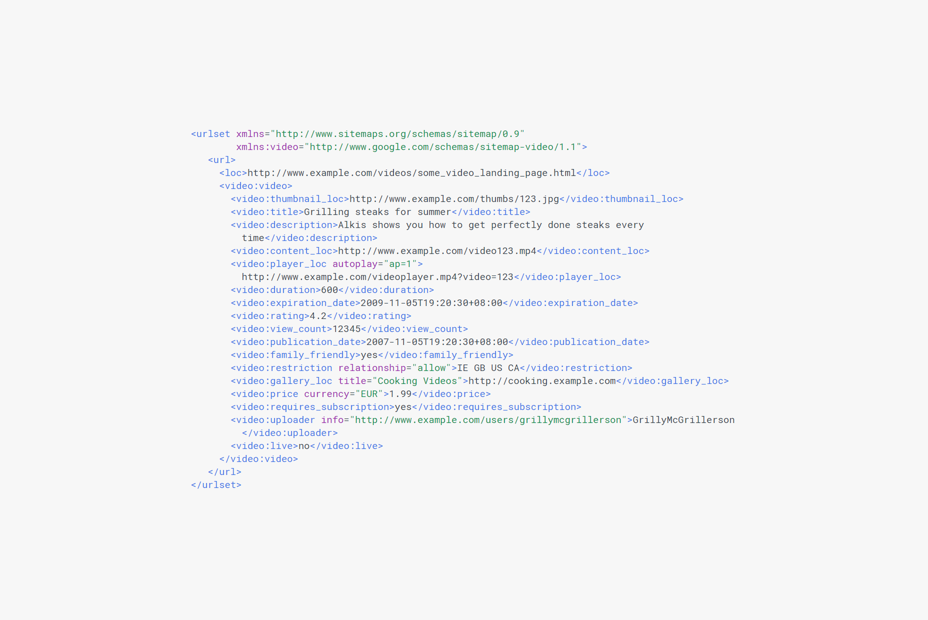
5. Create a Video Sitemap

Video sitemaps provide search engines with metadata about video content on a website and are an extension to your website’s existing sitemap.

You can use the sitemap to tell search engines about the category, title, description, length, and target audience for each video you embed on your website. In addition to this, you can also use it to give search engines more information about your video e.g. play page URL, expiration date, restrictions, and platform.

If your web page has a video on it then it’s sitemap may look something like this:

sitemap


Conclusion

Video content is gaining momentum.

There are a number of different ways that you can use video SEO tips to increase your video’s visibility, improve its ranking, and show up in search engine results pages. We showed you some of the ways you can get started with video SEO on your own website and, hopefully, you’re in a good position to take things further.

Read more

Blog fields

  • 5 minutes
  3086 Hits
  0 Comments
3086 Hits
0 Comments
Our team can work as an extension of yours
Let's start a conversation.
Contact us
  Cron Job Starts