

Welcome to our roundup of the best websites launched (or significantly updated) this month. July is a strange time to launch a site with the Summer slowdown in full effect, but these intrepid entrepreneurs have done so. We’ve got examples of great ecommerce, a couple of agency sites that we couldn’t resist, and lots of incredible art direction.
This month sees a big trend in compass navigation (a link in every corner of the page), and parallax is definitely still a big deal. Whether it’s inspired by the World Cup, or Le Tour, there’s a subtle gallic feel to a lot of sites this month…savourer!
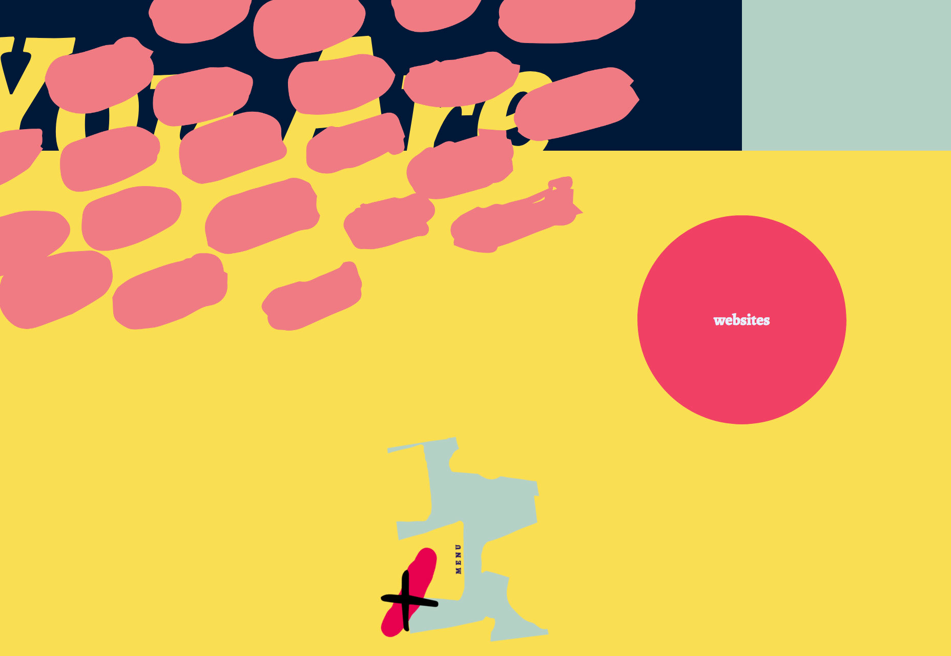
Drift
Drift is a creative agency with some chops. Rejecting the minimalism that seemingly every other agency opts for, they’ve put together a charmingly animated, hand-made site. Not too functional, unless your aim is to communicate creative courage—they stand out.
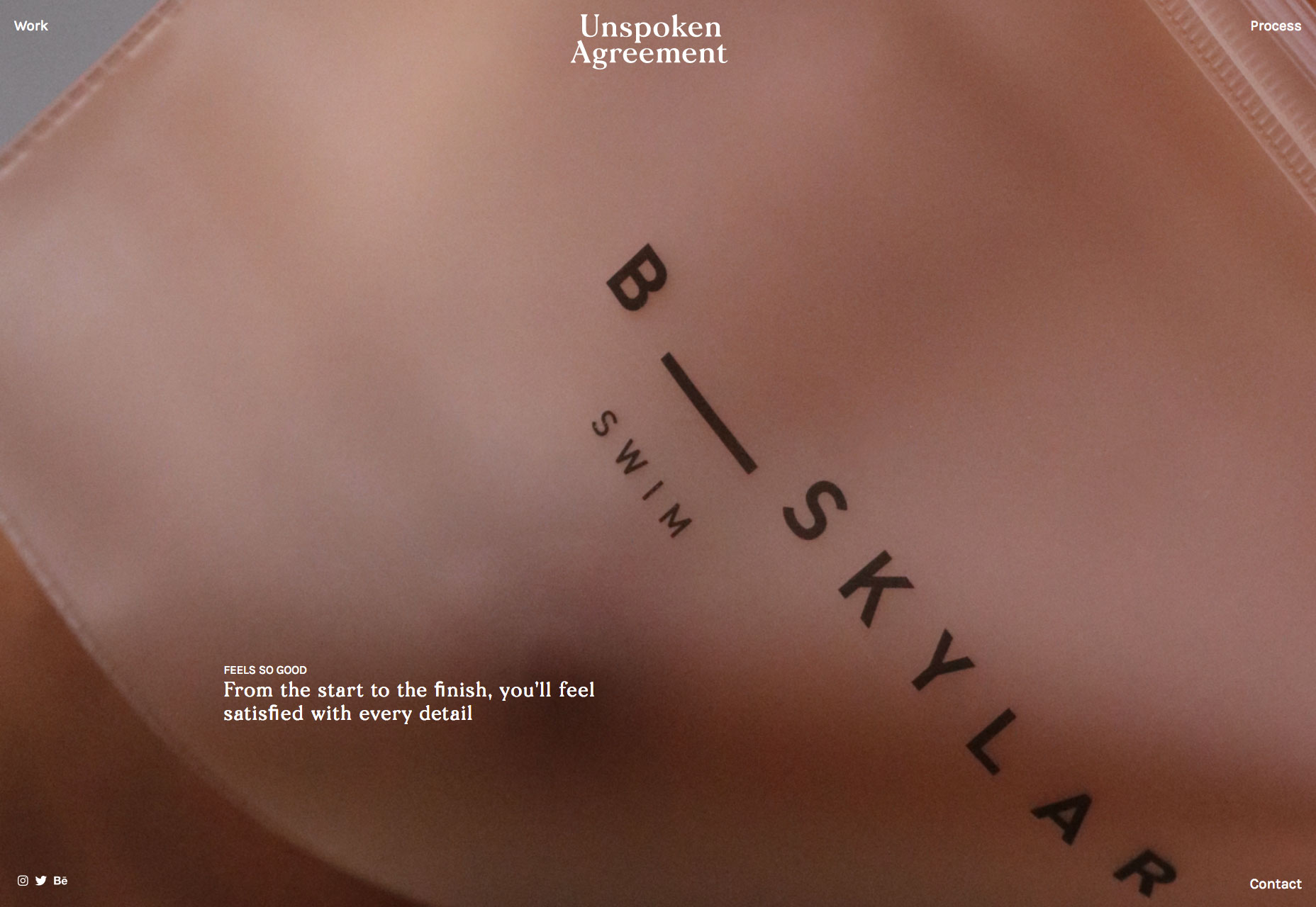
Unspoken Agreement
Unspoken Agreement is a creative agency that believes in beauty. Its landing page is a schooling in art direction, and the simple bold copy is persuasive. I’m not sold on the compass navigation, but you can’t have everything.
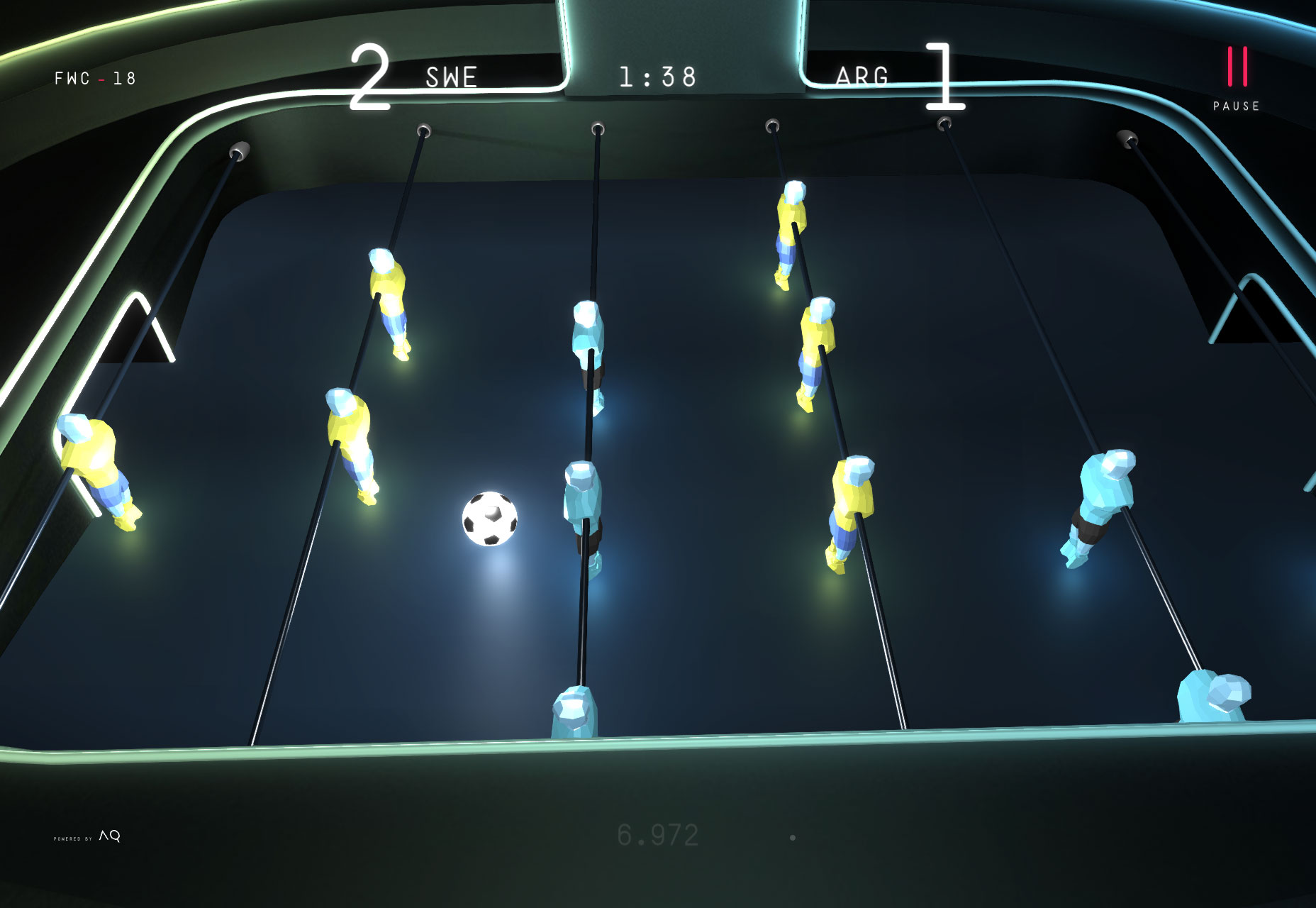
2018 Foosball World Cup
As the final whistle is blown on the Fifa World Cup 2018, this awesome site gives you the chance to relive this Summer’s big sporting event from the comfort of your desktop. Pick a team, and click and scroll your way to victory. No spinning those bars!
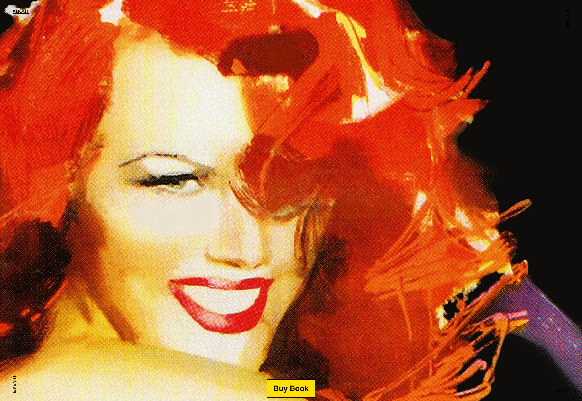
Pittori di Cinema
The site designed to promote a book about film artists, Pittori di Cinema, is a suitably bold site with masses of color and strong lettering. Simple to use, it features that compass navigation again. But the graphics are something to behold.
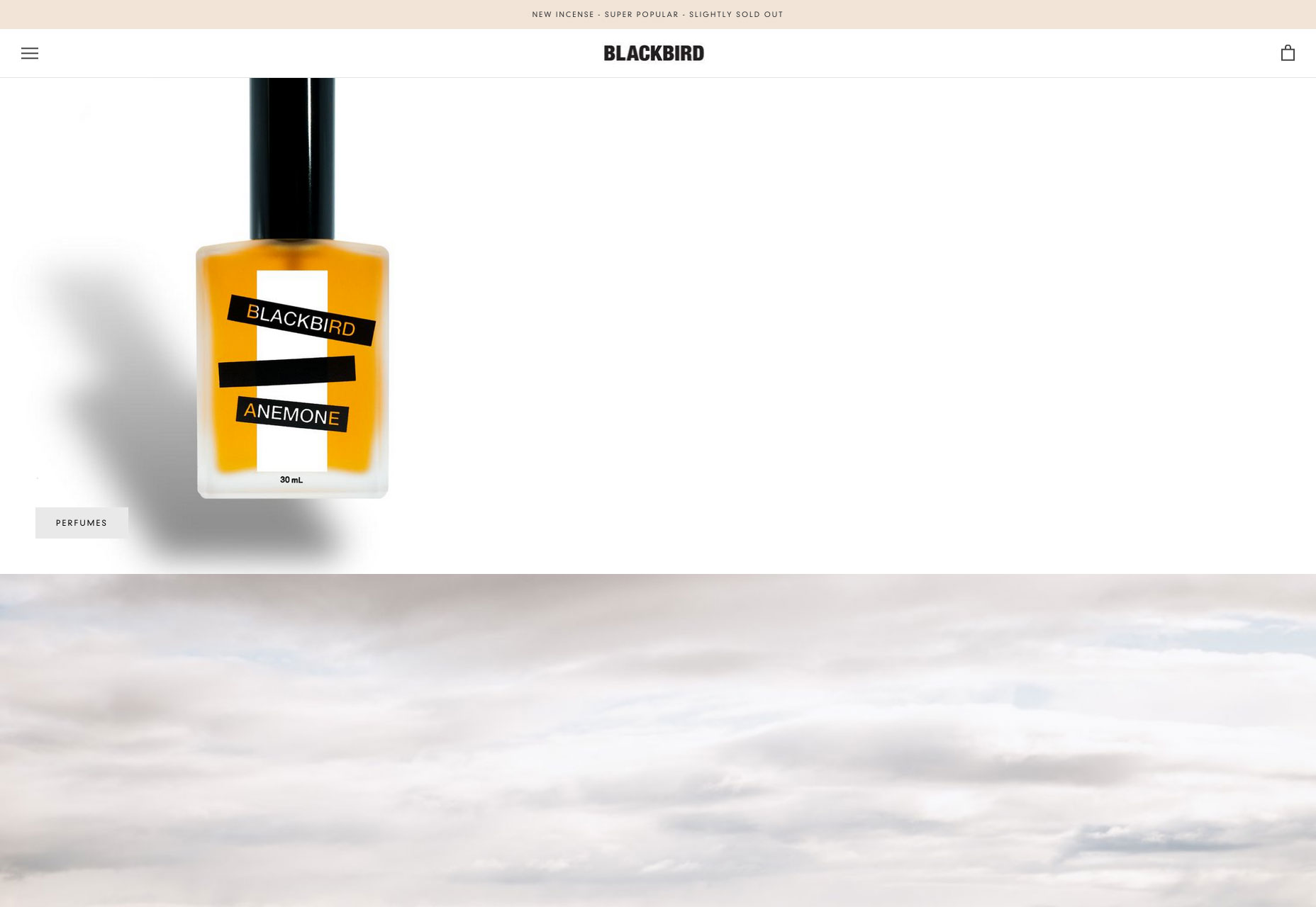
Blackbird
Blackbird is an beautifully minimal Shopify site selling perfume. The site is a great example of how effective parallax can still be, if used effectively. I have no idea what that weird frog video is for, but it’s intriguing nonetheless.
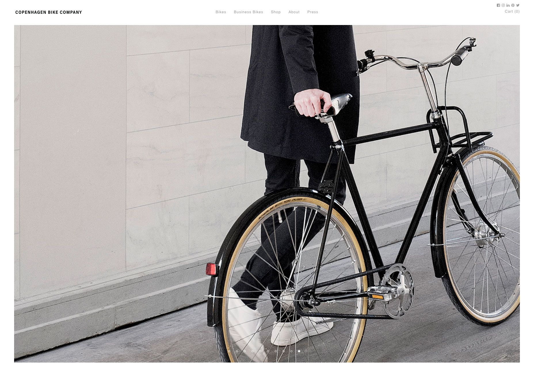
Copenhagen Bike Company
If Le Tour is making you feel like cycling, but you don’t quite have the energy to make it up the Pyrenees, wander north to discover a cooler, more laid back approach to cycling. The site for the Copenhagen Bike Company features on-brand art direction, smooth UI details, and high-end minimalism.
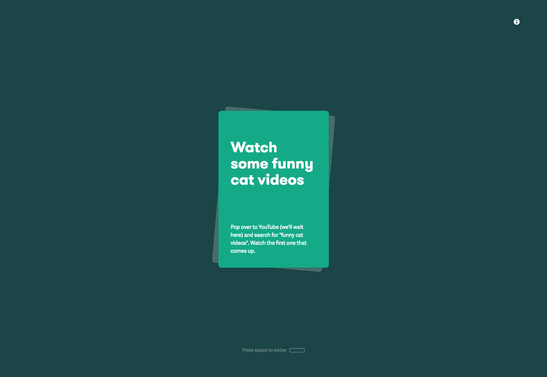
Care Cards
We all get a little stressed from time to time, it’s OK to admit it. Care Cards is a progressive web app with over 80 kind tips to help you cope with the rigors of modern life. Just open it up on your phone (or notebook) and swipe through the gems of wisdom. I love this site.
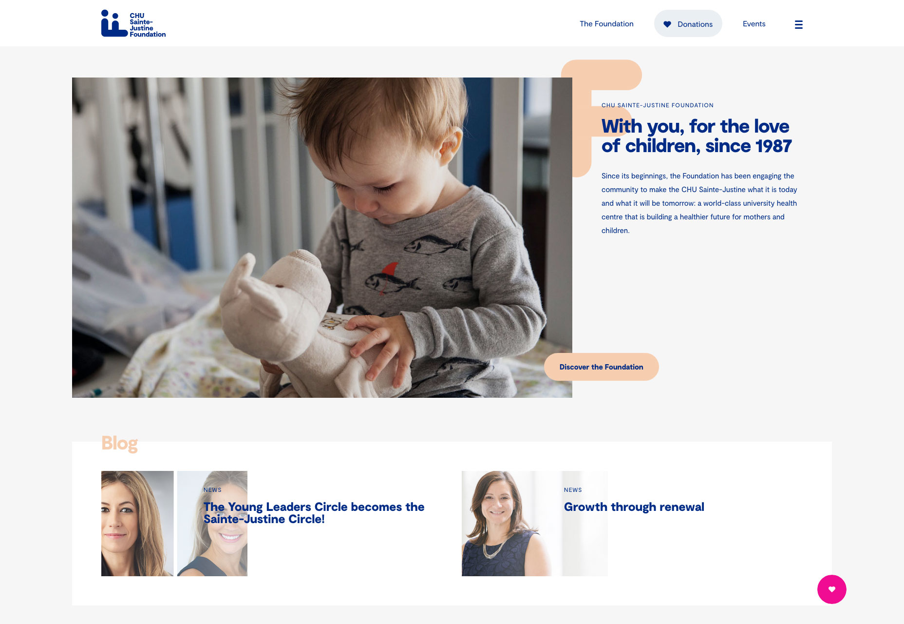
CHU Sainte-Justine Foundation
Promoting fundraising for Canada’s premier hospital for the pre- and post-natal care of mothers and children. The strong grid layout, coupled with smart brand choices and subtle animation is a winning combination for this important cause.
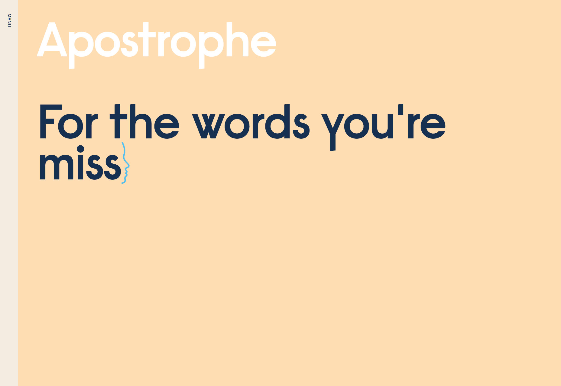
Apostrophe
It’s always hard to design a site for copywriters, but this site does so beautifully. Hooking up the leading animation to the scroll of the page is an excellent device for driving home exactly what this minimal site is promoting.
Contemple
Another design agency showing us something special, this time it’s an amazing ripple effect on their slideshow as you scroll through the featured projects on their landing page. Click through to the case studies and there’s some awesome work on display.
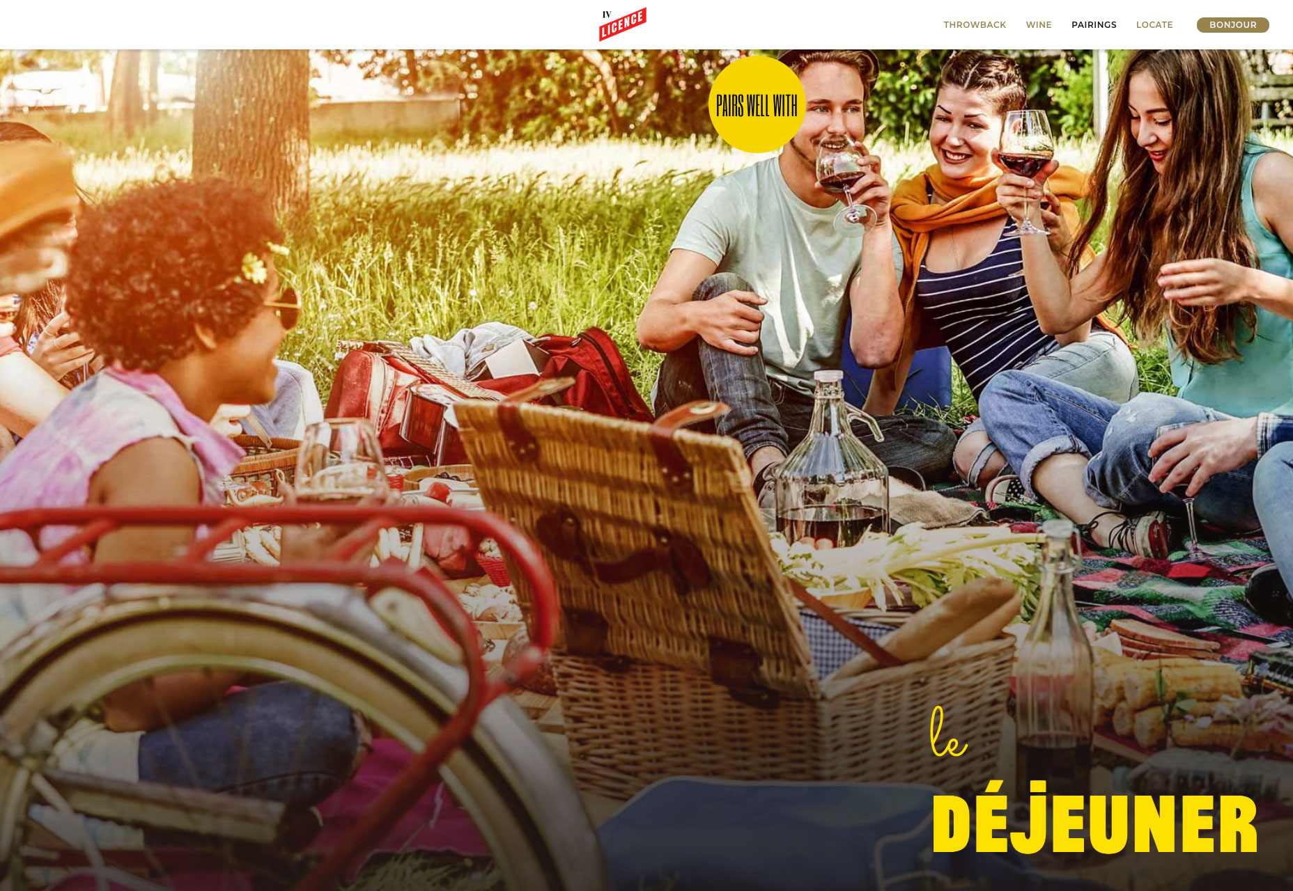
License IV Wine
This simple one-page site sells a wine brand perfectly, by capturing the spirit of community around a good bottle of French wine. The License IV wine label is bringing French savoir faire to wine drinkers in the USA with this charming site.
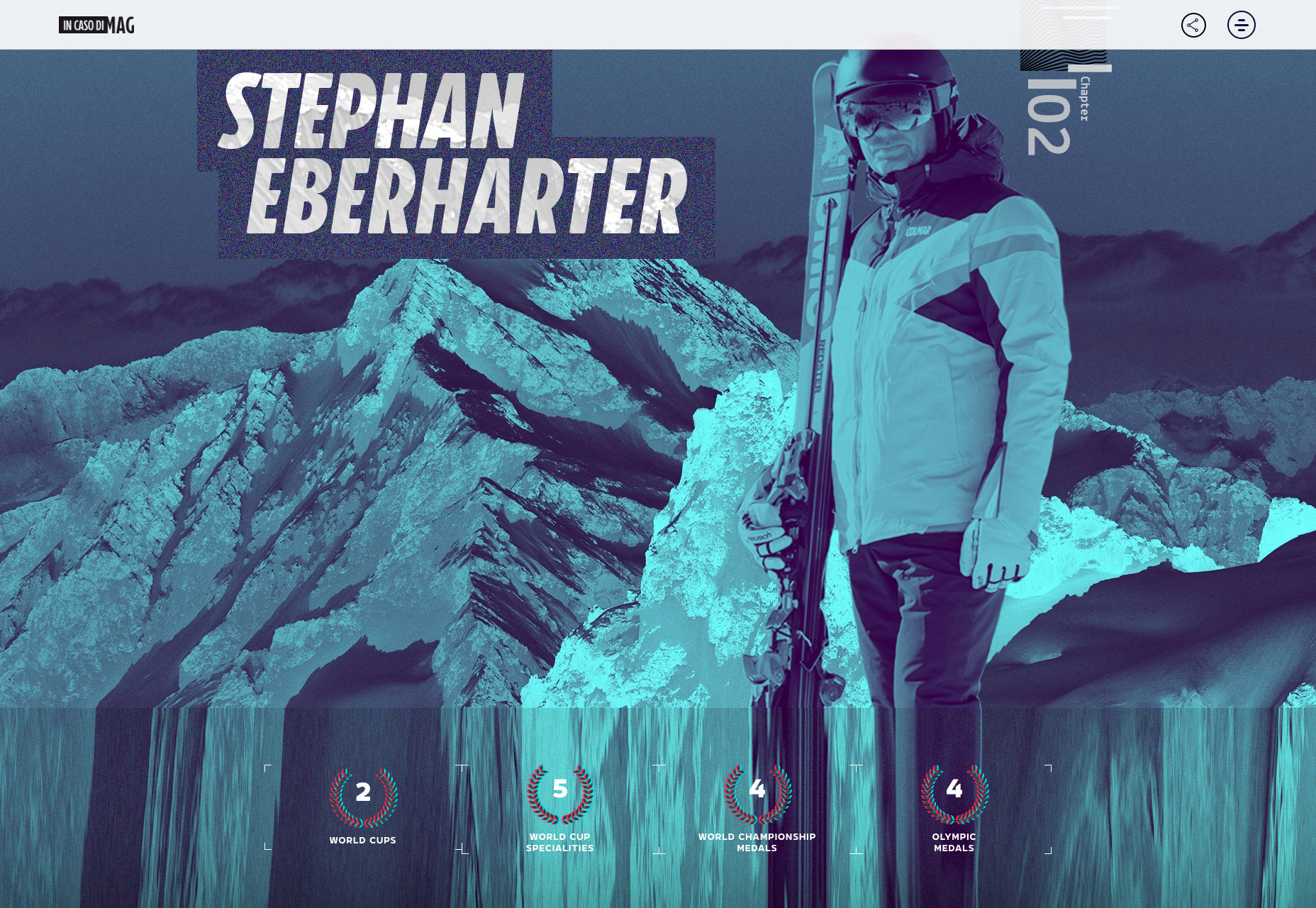
In Caso di Mag: Kitzbühel
Kitzbühel is the latest in an ongoing series of craftily designed travelogues around the world’s best ski resorts. Each location gets its own page, with custom art direction capturing the spirit of each place. I love the attention to detail.
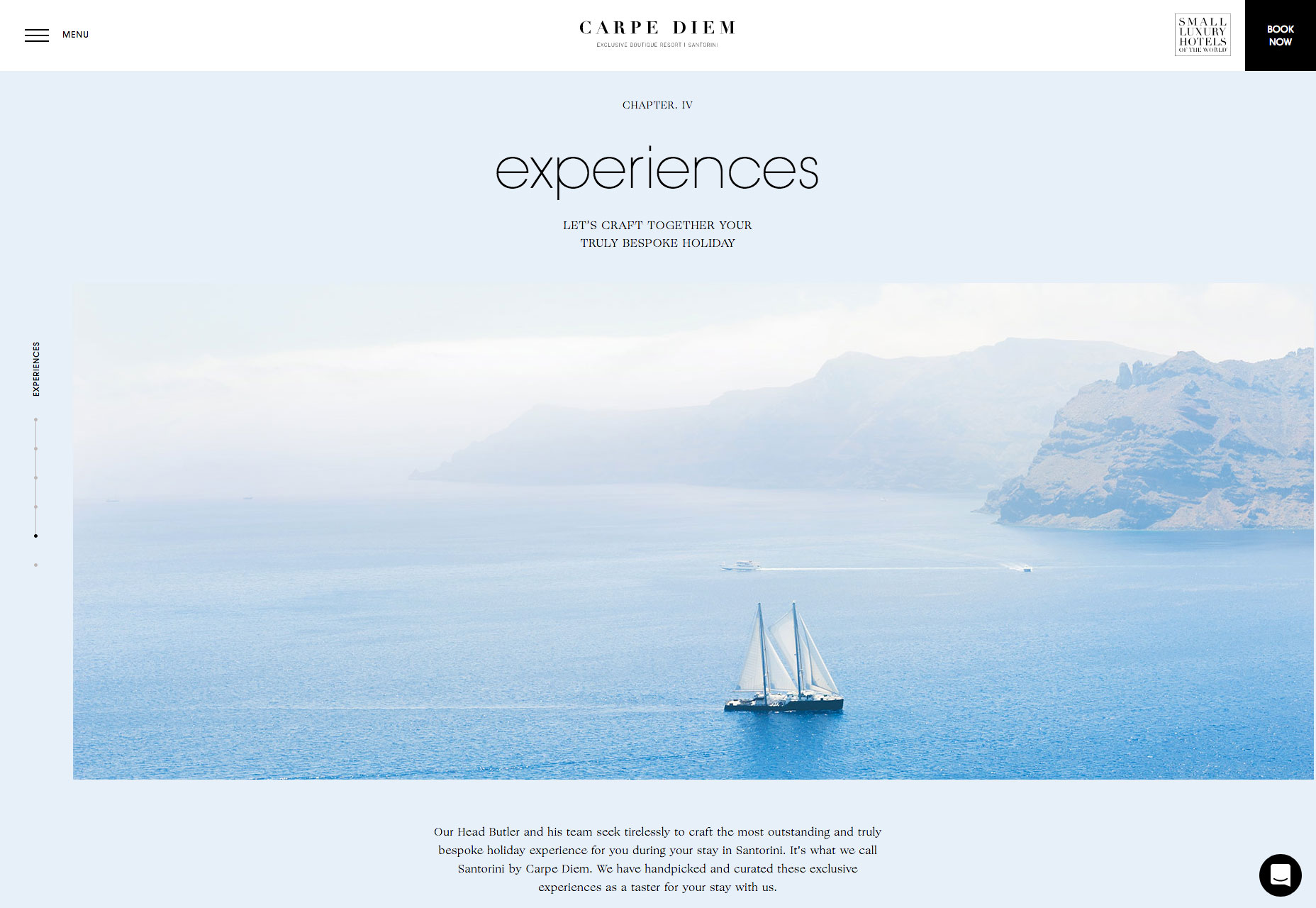
Carpe Diem Santorini
If there’s one place I’d love to spend some time, it’s among the cycladic minimalism of Santorini. The tiny Greek island is world famous for the beauty of its sunsets, and this enchanting site sells the romance of the destination perfectly.
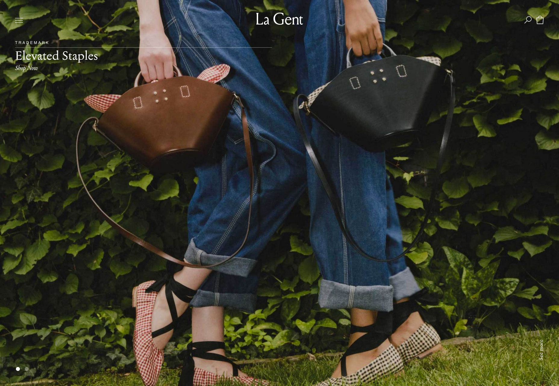
La Gent
Who doesn’t love quality, independent brands that put timelessness ahead of fashion. La Gent’s site is designed for browsing. I love the fact that their slider has just two items, enough for variety but not so much that you get lost.
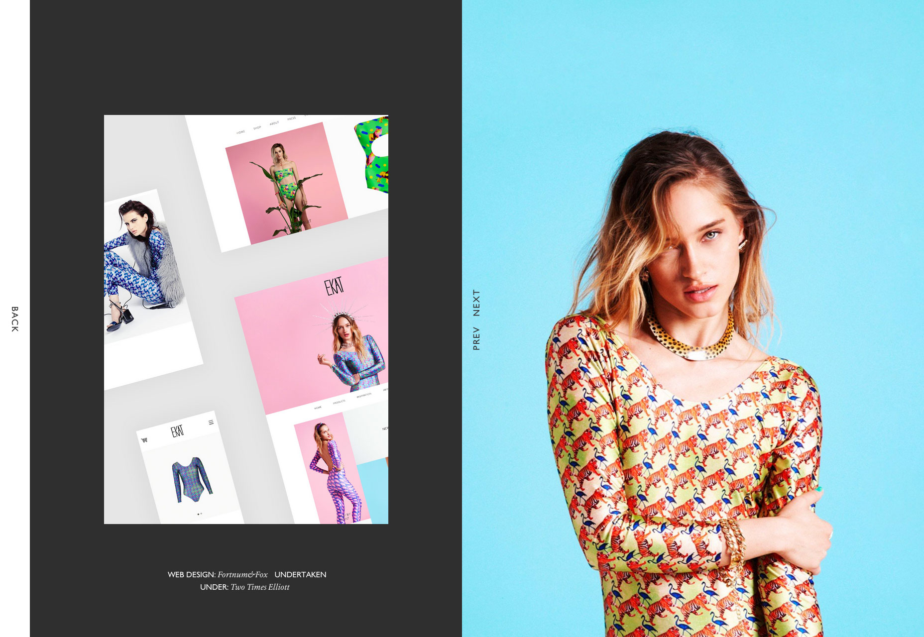
Fortnum&Fox
Another design agency with a flair for art direction, the site for Fortnum&Fox features an exceptional split screen design showing off an impressive back-catalogue of work. I particularly like how cohesive and simple the whole experience feels.
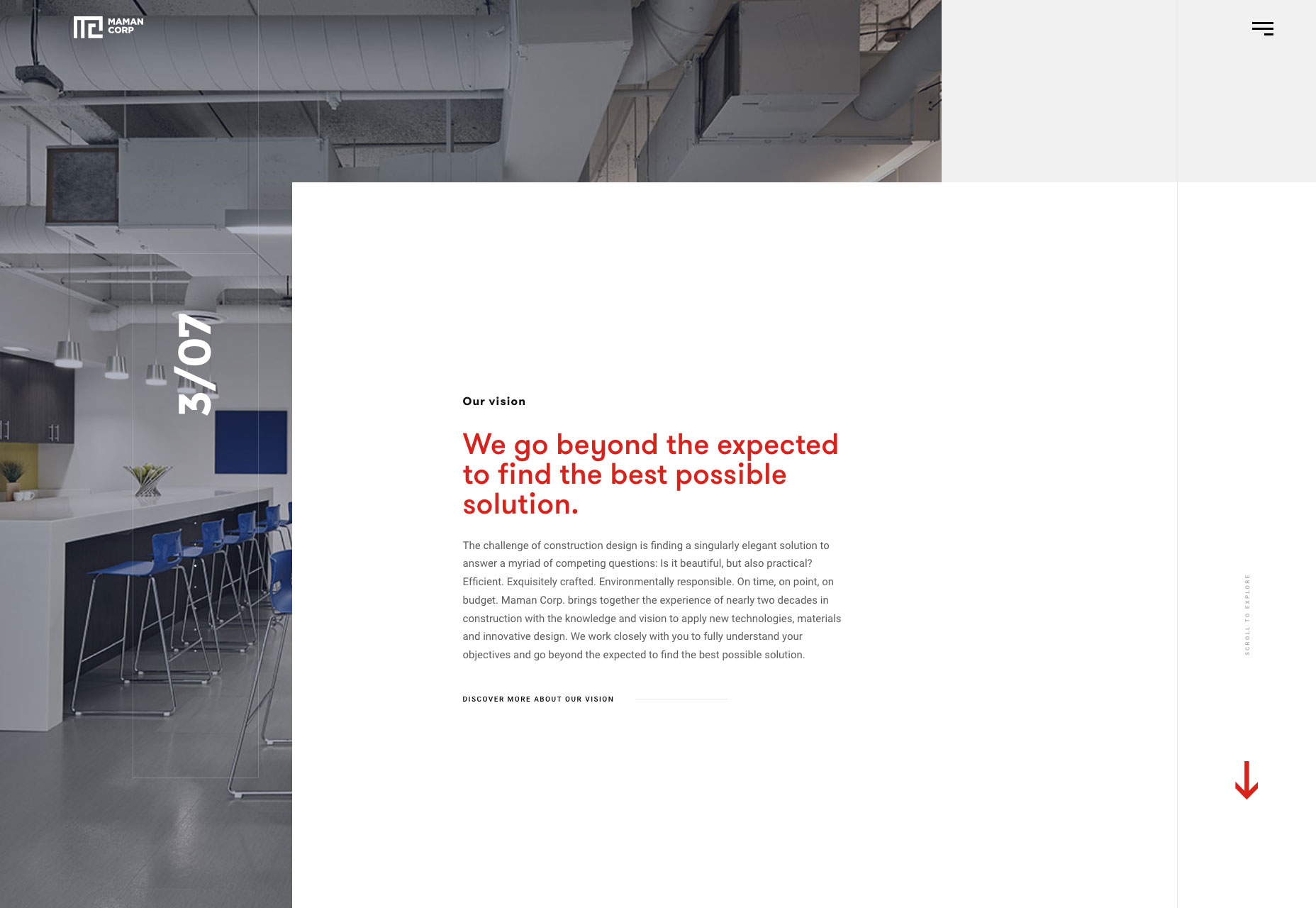
Maman Corp
Maman Corp is a construction company and their site reflects this with a grid-based layout and animation that feels like the site is being constructed before your eyes. I love the full-screen video and beautiful typography.
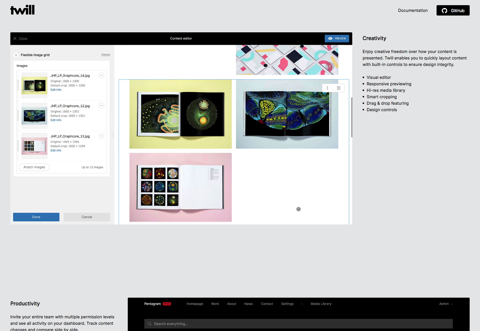
Twill
Twill is an open-source CMS kit for Laravel, offering increased productivity and more control. It’s promoting itself to developers, and that’s never an easy task, but breaking down the benefits in this one-page site it’s clearly worth checking out.
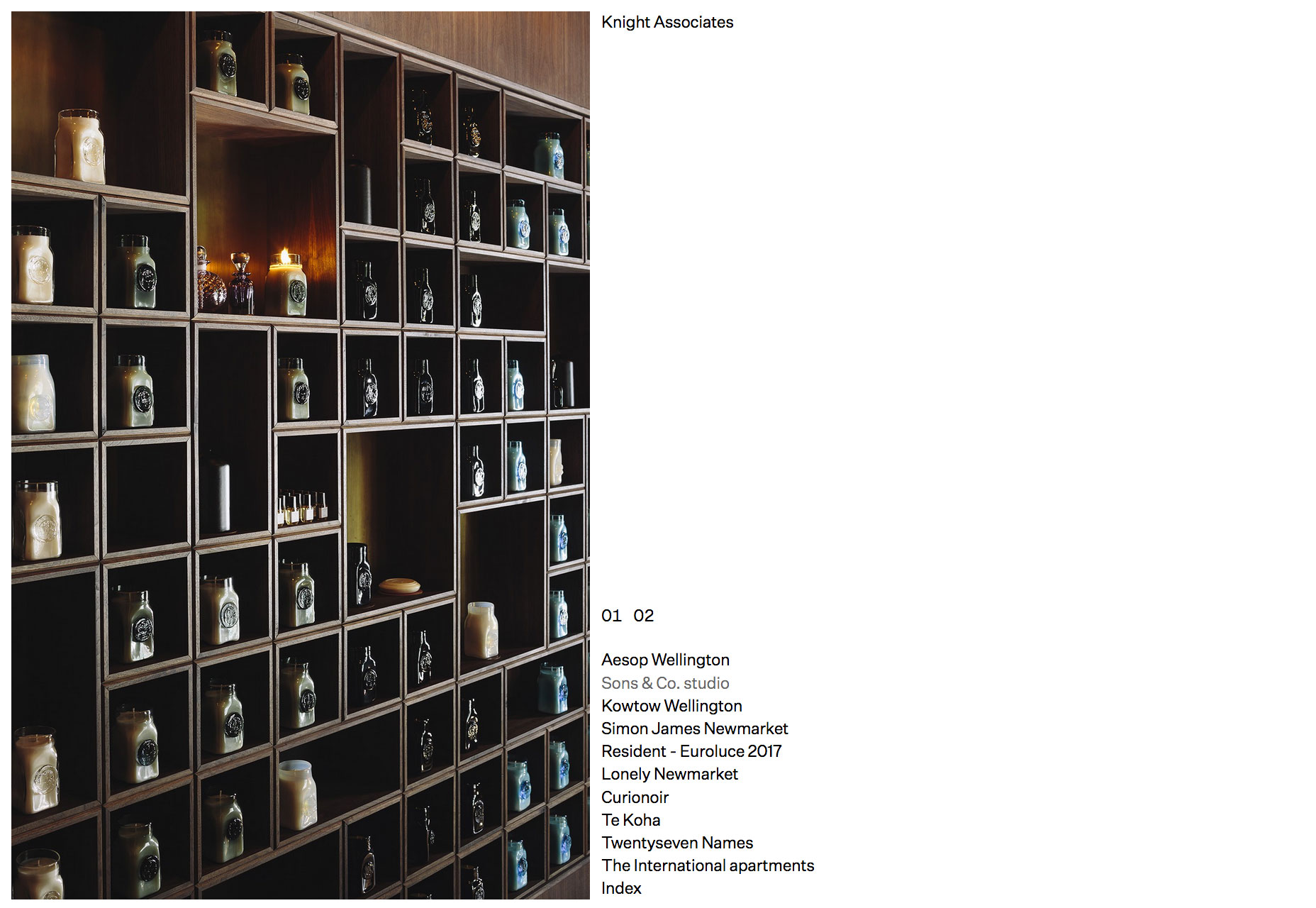
Knight Associates
You don’t get more minimal than this site for a New Zealand-based interior design firm. A simple list of projects click through to case studies. It’s a exercise in restraint from the design team than fans of simplicity will love.
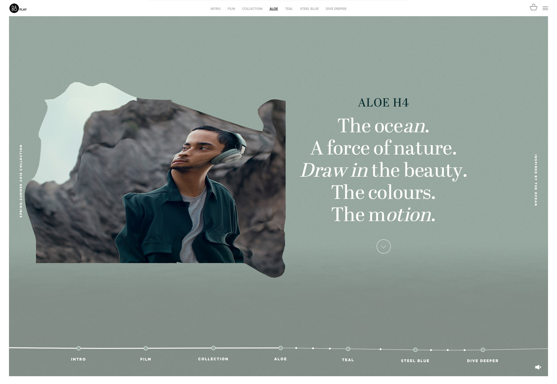
Bang & Olufsen SS18
Bang & Olufsen’s spring and summer collection features aloe, teal, and steel blue hues inspired by the ocean. The whole microsite feels like its floating in water, and there’s a great liquid hover effect on the images.
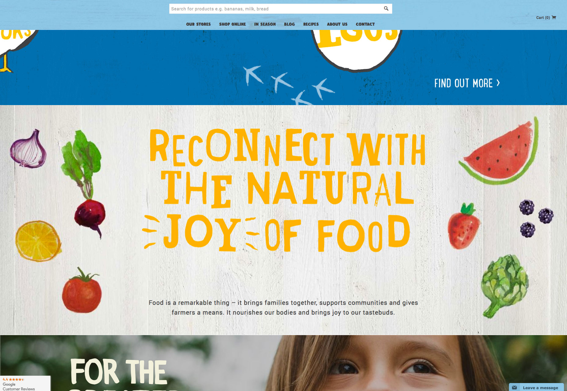
Harris Farm
If you’ve had your fill of minimalism for this month, then browse over to Harris Farm. The positive feeling site is packed with illustrations and lettering that capture the spirit of this healthy, food-loving Australian company.
 – A Complete Guide")
")

